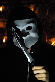
In order to have a idea of what the mask looks like photographed we carried out a series of test shots with different styles of lighting a poses. We used photoshop to manipulated the images.
The one is really strong and ominous, the knife looks really strong in the image, this image could possibly give too much of the film away on a poster .
This photo is really good the shadow is very sharp and strong on the white mask. The lighting is direct and this allows all the contours of the mask to be shown. The black clothing creates almost a foreground for the mask to rest on.
This was a very quick edit on Photoshop- We created a very rough poster in the style of halloween to see if it would work for our poster and I really think it does. The hand is skewed and bent which presents more ultra-violence.
The only full body shot used, this is good although shot in a garden- but it does take away the sort of alien presence that is delivered in a close up. The could work better for the magazine rather than the poster.


No comments:
Post a Comment