Monday, 26 March 2012
How effective is the combination of your main product and ancillary texts?
A directors commentary on how effective the combination is of our main product and ancillary tasks.
Billy Holmes
Charlie Fairs
What have you learned from you audience feed back?
What have you learned from you audience feed back?
Example of the 'Concrete Garden' audience survey


QUANTATIVE DATA
Age

Gendre

We asked this question as it is important to know what kind of audience would be expected to go and view the film, for this instance the large percentage of our audience of our trailer was male at around 67% whilst the female audience was 33%. Using this data it can be inferred that it is likely that the main target audience for our film will be predominantly male, this may be because of the heightened appeal of horror/thrillers to males in comparison to females.
Genre

We added this question to the survey to make sure the audience knew what type of film they would be seeing if they decided to go and watch the full-length film at a cinema. From the beginning we had wanted to make a hybrid of horror and a thriller film and therefore from the data from the graph it can be said that we have been successful in doing so.
What certification would you class this film as being?
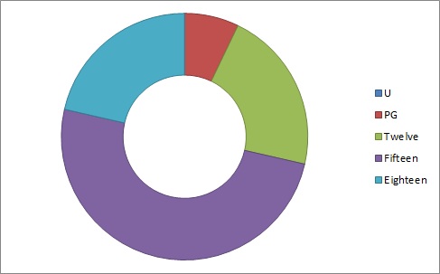
We asked this question as it is important to know what your potential audience thought the certificate of your trailer was. Due to our target age group of 15-24 the certification of a 15 was the main certification we were aiming as therefore more people would watch our film. However, 50% of the audience also chose other certifications such as the trailer being a PG, TWELVE and an EIGHTEEN therefore it may the trailer could have to be edited more to either add or lose particular scenes which cause it to go up and down in certification rating. We would want at least 75% of the audience to believe it had a 15 certification as this would gain the largest age group of active cinema goers who could potentially watch our film.
Did you sympathise with the main protagonist?

The result of this question would have changed the product dramatically if a large proportion of the audience did not sympathise with the main character in our film. If they did not sympathise with this character than the horror and thriller aspect of the film would have been largely lost due to the audience not caring about her safety and there not caring about or even wanting her to have bad consequences in the film. However, as it is shown in the graph above a large proportion of the audience (93%) did sympathise with the girl and therefore this would help the films popularity and therefore the box office intake of the film.
Would you watch the film if it had a general cinema release?

The audience response to this question was very positive as a large 93% of the responses were 'yes'. The purpose of this question is for us the creators to know whether there would be an audience if the film were to be released on the grounds of a successful trailer as this would be a large indicator to show if we had made a good, enticing trailer.
What would you rate this trailer out of 10?
Alike the previous question, this would give us a general idea on whether there would be a potential audience if there were to be a feature length film release. The average of the group was a 7/10 (43%) and with only 14% of the rest going lower than that it was obvious that there was a very positive outcome from the audience. However, this did show that the film did need improvement as successful as we had hoped for and therefore using qualitative data we will be able to know where we can improve in our trailer.
Qualitative Data


It was important for us to gain qualatitive data as without this it would be harder to find out the true opinion of the potential audience of our film. We gained our infomation through the audience questionnaires/surveys, with youtube comments and by creating a Facebook page where people were invited to discuss and comment on our 3 products; trailer, poster and magazine cover.

Another important way of gaining qualitative responses was through video interviews, in this video on youtube we ask random people what they thought of our poster such as what they did and didn't like and what they would improve on and to make sure we were giving the correct image of the product as being a thriller.
What have you learned from you audience feed back?
Survey and Screen Testing/Focus Group

We did a group showing of around 25 people of mixed ages and sex. We created a survey in order to recieve useful information on how the audience reacted to our trailer.
We surveyed over 30 people ranging from 15 to 35 this allowed us to receive a good and diverse amount of information in order to learn about how effective our trailer was.
Many people came up to us after the screening and gave us same face to face appraisal and critisism alongside the surveys this really help to understand the strengths and weakness's of out trailer
Facebook Audience Feedback


'sound and editing are really good. Generally really cinematic and thrilling.'
'The soundtrack works really well to build up tension, and the general cinematic experience is thrilling'
' I kind want you to make the actual film'
'The trailer is well done'
'Soundtrack is excellent-looked phallic so was thinking sex crime'
'Good steady filming, sense of menace profound'

'it's a really well put together trailer, engaging too'
'nicely composed shots and great editing of scenes'
'pretty gory but thats clearly the intention'
'loved the 'its a bit lonely''
'Very slick editing'
Overall using a social network allowed us to receive feedback from a varied range of ages, we manage to understand the weak and strong points of our trailer and whether this trended or not. We also could see how successful our trailer was at employing the correct emotions on to the viewer, the feedback has shown our weak and strong points but overall the public seemed to really enjoy it and were very engaged.
Voxpop
A short vox pop in order to get audience feedback about 'Reel talk' Film magazine.
We approached a number of random people to give us immediate feedback on our film magazine, as our product would be sold to the general public this was ver useful to see whether it could prove successful.
People liked the font of our magazine cover and the style applied, we were very happy with this feedback as we carefully choose a film specific font. Many people really like the thematic colour scheme applied to 'reel talk'. Our more subtle aspects of our magazines were also remarked upon such as the 'cult issue' and the background applied this was very good to here as these things are just as important as the more explicit images and text. The main photo was also very well recieved and this is the first image you are drawn towards, with the feedback we could learn how effective 'reel talk' was at attracting a 'film hound' audience.
Interview for poster
Audience interview on 'Concrete Garden' Film poster
Uploaded instantly from Android Phone
We interviewed an 18 year old male in order to get in depth feed back about our newly created poster, we chose him because he would be the core audience for our film.
'I find the poster very dark'
'Theres a horror side to the story'
'I was first drawn the central mask image'
'The mask itself is quite mysterious...maybe part of the story is to do with hidden identity'
'Hiding from someone who is looking for you'
'I think its a very good poster'
'More content and depth could be applied to the image'
'It is something i would definitely go and watch'
Summary
Monday, 19 March 2012
Friday, 9 March 2012
How did you use new media technologies in the construction and research, planning and evaluation stages?
How did you use new media technologies in the construction and research, planning and evaluation stages?
Magazine Front Cover 'Reel Talk'

REEL TALK MARCH 2012 ISSUE
CREATED BY CHARLIE FAIRS AND BILLY HOLMES
CREATED ON ADOBE PHOTOSHOP AND ADOBE INDESIGN
ORIGINAL PHOTOS
'CINERAMA' FONT
Thursday, 1 March 2012
In what ways does your media product use, develop or challenge forms and conventions of real media products?
In what ways does your media product use, develop or challenge forms and conventions of real media products?

Title
Our
title frame for our film ‘Concrete
Garden’, we aimed to challenge the normal conventions of a film title
screen as with most the use of a plain and usually black background is usually
employed behind the film text, however with our title we wanted a more interesting concept for our audience to focus on and therefore stand out from other films.
The textured background has been used to give a concrete feeling to
the screen to link with a key feature in our film, with the locations mainly
being urban areas. The concrete in the background has been eroded also and is
not smooth and this is used to show that the film and the film characters all
have rough edges and also that the main characters mind is being slowly eroded
away by the antagonist who wants her to join his cult, this texture is used
throughout the trailer apart from the final billing block.
The positioning of
the text in the shot is also kept constant throughout the trailer to keep the
audience focused in the same area and to make sure it is clear what the text is
stating, also for the final text slate being the title of the film we made the
font larger than the rest of the slates to make it stand out from the other
slates so it is the text that it most likely to be remembered by the audience.

Narrative
When it comes to thriller and horror films it is increasingly difficult to have
an original narrative but for ours we have developed and mixed different
narratives into one, for example we have used biblical aspects alike ‘The Da Vinci Code’ and also typical
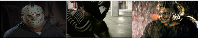
horror conventions from classic films such as ‘Friday the 13th’ and ‘Halloween’ due to the use of a mask for the main antagonist
character to create more of a machine rather than a human due to the lack of expressions visible, making the audience have less of a connection with this character but also create an atmosphere of unpredictability.
We wanted people to question and doubt the different aspects of the
film and after seeing the trailer wanting them feel confused and curious so it
would lead to watch the film as a whole, points in the film where the narrative
switches help do this for example the introduction of the masked character with
no previous mentions can be shown to be very confusing. To challenge the normal
conventions of a horror/thriller trailer successfully would be very difficult
and hard to pull off whilst developing the conventions of is likely to have a
more positive outcome and therefore we decided to do develop.
Character
In terms of our characters we have used conventions of horror/thriller such as
the female lead role figure that is vulnerable such as the horror film ‘Carrie’ as this is a very key in way in
gaining an emotional attraction between the audience and the main character.
The convention of the antagonist also Mark Francis/Masked Figure also follow
conventions of horror/thriller films, Mark is the creepy stalker type such as
Anthony Perkins’ character in ‘Psycho’ whilst
the masked characters resembles Jason in ‘Friday
the 13th’ or Leather face in ‘The
Texas Chainsaw Massacre’ due to the mask and also the violent nature of the
character. These conventions in the trailer/film have been used to make it
obvious and clear that the film is being sold as a horror/thriller and
therefore will gain the correct target audience and therefore good word of
mouth.
It is also important to have obvious main characters in the film which
are shown in the trailer so that the audience are able to enter the cinema
having a vague idea of who is in the film and therefore potentially adding the
want to see the particular film.

Genre
For
our film the genre we were aiming for was a hybrid between a horror/thriller as
both are similar in the ways of their narrative and filming and can be both
developed and mixed greatly to create a new type of film which has symmetry. Conventions of this genre include violence, mystery, suspense and drama, our
film aimed to include all of these themes to make sure the audience knew what
film they were going to see. Violence is shown at the end scenes in car park
and this particular shot with our protagonist is taped up and her expression
shows her stress and fear for what is happening and therefore the audience are
made to reflect this emotion. For the film there would be little violence until the end segment of the film as for the first two segments there would mainly be a psychological aspect to the film whilst the antagonist messes with the head of the main character Emma, this convention can be related to the film 'Silence of the Lambs' where the psychotic serial killer played by Anthony Hopkins with the amateur cop Jodie Foster until the very last segment where the film climax's in a series of murders and killings caused by this one man.
Other conventions used to show that it is part
horror is the use of mask which has been used many times before in previous
horror films, by using a mask the person is made to look less human by being
unable to express emotion and made more like to be a machine, which as a
consequence makes the character more threatening and volatile in there actions
to the audience. The use of dark gritty lighting can also be used to give the right tone to coincide with the genre of horror as the audience would relate this tone and graphic to a particular genre.

Graphics
For our graphics such as our titling and overall ‘style’ of our film we wanted
to mix and develop common conventions of a horror/thriller trailer with
biblical elements due to our narrative being linked with the bible. Therefore
for our font on our titles we took inspiration from biblical text such as the
font in the shot of the bible in our trailer which we found using various font
websites as hopefully the font will be recognisable to many and they will be
able to make that link.
The beginning of our film shots such as the shot of the
estate block is used as the foundation for the graphics of our trailer; the
shots have been filtered such as de-saturation and flow nicely into the text slates
which have a grey texturised background. For the text also the use of glows for
the text is linked to the ambient sepia shot of the main character walking in
an urban area which has a yellowy tinge. Graphics have always been linked to
the type of shots and tone used and therefore we are using a previous
convention.

Setting/Location
In ‘concrete garden’ we have three strong shots that establish location immediately, an urban, British and gritty backdrop for a Psychological thriller. We purposefully chose a day with bad weather in order to depict these landscapes in a more rugged light. We chose a shot of ‘Emma’ in central London walking by her self, this was on purpose so that the location could be recognised by people who don’t work and live in the city, and this showed juxtaposition to the south London tower blocks.
For the meeting of the two characters, we chose the outside of train
station so that the audience could understand the link of them going to the
same college, subtly we included a red phone box in this shot to again show it
was London- an iconic global image. The other locations for Act 1 and 2 were
based around a nice, modern flat in London in private residential area; this
was because we wanted the audience to feel like this home was a safe normal
environment whilst evil also interfered.
The areas were fairly normal as the character of ‘Mark’ stalked ‘Emma’ to
her home, this was to draw more attention to the actions occurring rather than
the background and what was happening. This choice was to add the idea that
evil people can come into contact with you anywhere, this slightly pastiches
the film ‘Rosemary’s Baby’ in which pagan rituals occur in a Manhattan flat.
The use of a regular modern flat allowed ease of filming and lighting, it
created a realistic setting for the start of a trailer. For the end of Act 2
and the rest of Act 3 we needed a location that would provoke horror and
mystery, we used an abandoned underground concrete car park in order for our
montage of chase scenes, violence and ritual to happen. This space we believe
is completely unique and unused by any film, this really added to the mystery
element to our genre.
We played up to the conventions of our genre by picking a empty, isolated space that at the same time was completely contained. This major location had a range of places we used to film, the slowly descending ramps, stair case and a ventilation room provided us with a perfect place to film a face paced montage sequence with strange and curious events occurring with in them.
We played up to the conventions of our genre by picking a empty, isolated space that at the same time was completely contained. This major location had a range of places we used to film, the slowly descending ramps, stair case and a ventilation room provided us with a perfect place to film a face paced montage sequence with strange and curious events occurring with in them.

Special Effects
Our film genre is not overly effect heavy typically,
although a number of techniques and special effects are used in order to
establish the genre. We didn’t choose to develop on the fact of showing blood
and gore in our trailer as many trailers chose to, we believe this was not
needed for our trailer as we wanted to create more of an air of mystery to
leave the audience slightly confused about the narrative.
One of the main effects we used was to de- saturate and
colour some of our frames, in order to have a stylistic aesthetic to our
trailer, this idea was taken from ‘The Machinist’ a film the pioneered our
genre in 2006. This effect we used for the opening three shots of the estate
blocks, we toned down the colour to flatten the image, and we made the colour
of the sky match on all three shots, this effect was employed to make the original
shots even more gloomy and eerie. This technique we used for the build up to
the montage to maintain fluidity and consistency in our lighting.
The sound effects we used we recorded on a micro-track, and
we later added them in at the appropriate times in our trailer, we used this
convention as it’s used in pretty much all Psychological thrillers and is almost
imperative to have in such high intensity situations. For our soundtracks we wanted to our two very
different tracks in order to separate a real and a dream world, we had to use
music editing software to change the speed and pitch of the tracks in order for
them to work effectively to the narrative.
For many of the shots in the car park we change the
colouring to a murky green, this idea of giving our film a familiar filter is
used in many of the films that inspired us, it also creates a mask of reality
that layers of the narrative.
In order for our trailer to appear more technical and advanced we use a few effects to some of our shots, for example the POV stairs scene we added a distort effect, to give you an idea of what that main character sees. We didn't want to over do the effects as they are simple to use and often look tacky and lazy.

Camerawork and Editing
Psychological thrillers trailers differ hugely in the way
editing is done and camerawork, some products in our genre have a few slow pace
of editing and many are incredibly fast even sometimes resembling that of an
action film. We decided to have a fairly normal pace of shot in Act 1 and 2, to
ease the audience into the essence of our film. Typically we wanted a fast
paced intense montage in Act 3, with an element of brainwashing with flashing
images of our antagonist, this allowed us to show the two different sides and
worlds within our film.
We used 1080p photography of a concrete wall for the
background for our text which interjected between the shots in our film, having
text to explain and suggest plot was incredibly typical but to use a layer of
graphics is not, this challenged our genre.
For our editing we occasionally used stylistic transitions,
most of the time we just jump cuts as a standard. To show a slow process of
time moving on we fade in some shots in act 1 of ‘Emma’ to show her boredom and
isolation. We used zoom in pull and burst from one shot of a bible to a close
up, this really showed intensity and promoted the element of mystery in our
media product, this is used in similar media products such as ‘The Ring’. Again
we kept the preset effects and features to a minimum and tried to create our
own to show originality in our trailer.
For establishing location shots we used long and wide shots
in order to give the audience a full perspective of the scale, this is used not
as much in our genre but it was interesting to challenge this. In Act 1 we used
3 shots that we continuous to show continuity, mostly in trailers this doesn’t happen
more that once so we decided to keep to that guideline. Any shot of ‘Mark’
talking we decided to go closer up than ‘Emma’ this was to show the intensity
of his character, to practically have him ‘in your face’. For the masked villain
we used a blacked out room, to show no location and have a dream like vibe
about it. In many of the shot we used a straight fixed shot to have a well set
up shot, but for some action scenes we hand held the camera to give a POV
experience personal to the audience, this is incredibly common in our genre
that we researched into.

Costume and props
Our iconic prop is our Venetian Bauta Mask, we chose this as
it hides the face and expressions of the people behind them, this presents a
feeling of the unknown and allows the audience to constantly question who is
behind them- this is directly link with the thriller element as they force the
audience to make assumptions in the narrative. This sort of mask has been used
in Kubrick’s ‘Eyes wide shut’ where this is also the theme of sexual violence
and satanic ritual. We clothed the characters with hoods and entirely black clothing;
this was to take away the human from the characters. Having a masked or strangely
dressed villain in our genre is fairly typical but we felt it necessary to add
to the horror elements we encorperated.
We had two different costumes for ‘Emma’ one for Act 1 and
Act 2 and another for Act 3; for the first two acts we dressed her in normal
student like clothing in order to present her as one, for Act 3 she was more
dressed down in order to show her vulnerability this is similarly done in many
films to make the character look more attractive and heroic. The actor of ‘Mark’
originally didn’t wear classes but we felt it would add to the creepiness of
his image, we dressed him smart casual to present him more as an outsider. ‘Mark’
is linked heavily to the mask characters’ and having him with classes on would
further separate them, much like Peter Parker and Spiderman.
We used masking tape, a large knife and wire in our violence
scenes to make the torture aspects seem as real as possible- these are typical
objects of torture.

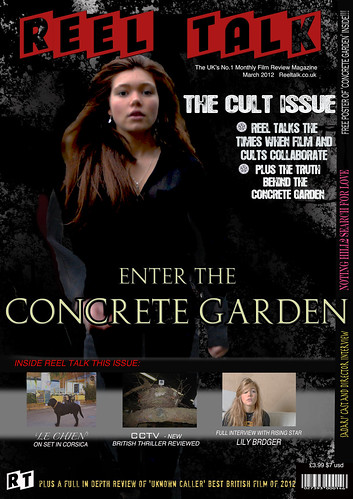
Film Magazine Cover
For our film magazine cover we played to the conventions of previous covers as we wanted the potential consumer to recognise the type of magazine it was at a glance, therefore the employment conventions included stills from films and the use of recognisable film related equipment such as the use of a film reel to portray shot of films. For our title we chose to call the magazine 'Reel Talk' as this can be shown to relate to film (film reel) and also show that the magazine is a film magazine which has a main focus on film such as reviews and previews.
Another image convention of Film magazine covers is the use of a main image which is usually a block buster of some kind surrounded by smaller less significant puff pieces about various subjects such as previews, reviews or miscellaneous subjects. For Reel Talk we decided to do the same as we placed our main protagonist Emma played by Lily Bridger on the front cover as she will be a USP to our film and people will be able to recognise the character and create the link with Concrete Garden. For the image we decided to do a studio shot of Lily rather than lift a still from the film as therefore we can get a better quality photo and also have the character look directly into the camera lens which is a normal convention of central images on film magazine covers. The background of this image swell will be similar to the graphics used in the film trailer such as the colour, texturisation and graphics so the audience will also be able to link this to the film and create a more intricate media product.
We wanted to create a compromise between the styles of 'Empire' and 'Sight and sound' we did this by combining styles of both magazines. We did this in order to attract a larger audience, we also used a few common convention by using a central character on a large scale and intrusively on the page much like 'The wolverine' empire cover. Having an issue theme 'The cult issue' allowed us to present our issue of our magazine in a certain light much like 'The Gangster Issue' on 'Sight and Sound'. We created other films in order to provide the consumer with further information on new film. Using an array of fonts for different articles attracts people into different parts of the magazine we used this convention as it makes the cover seem for versatile and interesting.
Other conventions of film magazines included obvious additions such as price, barcode and a website address which is a common theme throughout major film magazines such Empire and Total Film.
However, we did choose to develop conventions of normal film magazine covers by switching the colourisation of titles, our title font is called Cinerama a classic font used in 1950's/60's with a black/red/white colour scheme instead of a standard red and black title colour scheme which can be shown for Empire/Total Film.
We also wanted to add and create a larger more linked product in relation to a magazine, we decided to create our own logo (RT) to make it more recognisable to a potential reading audience. For most magazines this method is not employed and therefore this magazine will stand out from the rest of film magazines.

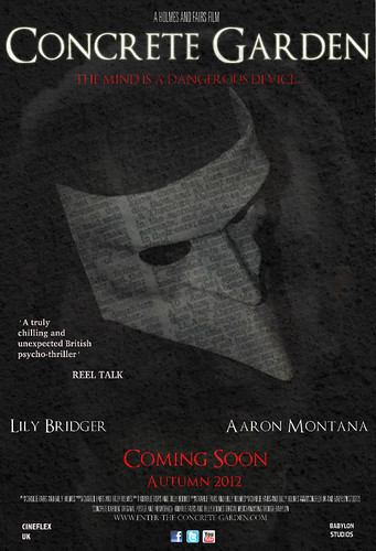
Poster
We chose to not stay to the typical conventions a psychological thriller poster and chose to take more of a horror film poster approach as we felt it was more appropriate in relation to our film. To present a continuous theme throughout our media product we used a font that was common and ran throughout the magazine and film as well, similar graphics were also used such as the concrete texturised background used throughout our trailer.
The layering of our poster was used specifically to give an eerie atmosphere, the layering included the use of the texturised background, a scanned page from the bible, a shadow of the antagonist and the main Bauta mask in the foreground. The use of layering each of these images led to a very eye catching and interesting poster overall.
The colouring of the poster also used conventions of previous horror posters which mainly included red/black/white as there main colour scheme, therefore the poster would instantly be associated with this kind of horror/psychological film. We saw this technique used in 'The Box', as believed it to very effective and ties in with our genre.
We chose the central image of our mask as we its the 'iconic' image of our film and provides the consumer with consistant image that works almost in the same way as a logo would. We have used this image at the forefront with our other images adding texture to this, in order to make sure the image wasn't flat we added lighting and shadow effects, as most posters have the image jumping out at you.
Most posters have reviews and ratings, we chose to use this convential minimally as we didn't want our central image to loose its impact. We use a line from a review from a magazine in order to make it look authentic, we have this smaller in size to the actors name to draw attention to them. To create the billing block we found and used the standard billing font and made sure it was of appropraite size on our poster ( around 1/8), we integrated details of a website and companies that helped to produce our film. We had mini logos of sites such as twitter, Facebook and Youtube so show the audience where they could find further information about 'Concrete Jungle'.
For our title we wanted to have it larger than an other text on the page, we had the text slightly embossed in order for it to appear less flat so it jumps out at an onlooker, this font was similar as the rest used to present the theme of defying religion. Conventionally most posters have a memorable tag line, we used 'the mind is a dangerous device' as ours as very have previously used this in our trailer this helps to shape the marketing structure of our film. We also changed the colour of text so let the title appear first then the tagline to be read second. Our poster used many conventions in our genre but also directly challenged them in order to open up our market and come across unique and creative.

Film Magazine Cover
For our film magazine cover we played to the conventions of previous covers as we wanted the potential consumer to recognise the type of magazine it was at a glance, therefore the employment conventions included stills from films and the use of recognisable film related equipment such as the use of a film reel to portray shot of films. For our title we chose to call the magazine 'Reel Talk' as this can be shown to relate to film (film reel) and also show that the magazine is a film magazine which has a main focus on film such as reviews and previews.
Another image convention of Film magazine covers is the use of a main image which is usually a block buster of some kind surrounded by smaller less significant puff pieces about various subjects such as previews, reviews or miscellaneous subjects. For Reel Talk we decided to do the same as we placed our main protagonist Emma played by Lily Bridger on the front cover as she will be a USP to our film and people will be able to recognise the character and create the link with Concrete Garden. For the image we decided to do a studio shot of Lily rather than lift a still from the film as therefore we can get a better quality photo and also have the character look directly into the camera lens which is a normal convention of central images on film magazine covers. The background of this image swell will be similar to the graphics used in the film trailer such as the colour, texturisation and graphics so the audience will also be able to link this to the film and create a more intricate media product.
We wanted to create a compromise between the styles of 'Empire' and 'Sight and sound' we did this by combining styles of both magazines. We did this in order to attract a larger audience, we also used a few common convention by using a central character on a large scale and intrusively on the page much like 'The wolverine' empire cover. Having an issue theme 'The cult issue' allowed us to present our issue of our magazine in a certain light much like 'The Gangster Issue' on 'Sight and Sound'. We created other films in order to provide the consumer with further information on new film. Using an array of fonts for different articles attracts people into different parts of the magazine we used this convention as it makes the cover seem for versatile and interesting.
Other conventions of film magazines included obvious additions such as price, barcode and a website address which is a common theme throughout major film magazines such Empire and Total Film.
However, we did choose to develop conventions of normal film magazine covers by switching the colourisation of titles, our title font is called Cinerama a classic font used in 1950's/60's with a black/red/white colour scheme instead of a standard red and black title colour scheme which can be shown for Empire/Total Film.
We also wanted to add and create a larger more linked product in relation to a magazine, we decided to create our own logo (RT) to make it more recognisable to a potential reading audience. For most magazines this method is not employed and therefore this magazine will stand out from the rest of film magazines.

Poster
We chose to not stay to the typical conventions a psychological thriller poster and chose to take more of a horror film poster approach as we felt it was more appropriate in relation to our film. To present a continuous theme throughout our media product we used a font that was common and ran throughout the magazine and film as well, similar graphics were also used such as the concrete texturised background used throughout our trailer.
The layering of our poster was used specifically to give an eerie atmosphere, the layering included the use of the texturised background, a scanned page from the bible, a shadow of the antagonist and the main Bauta mask in the foreground. The use of layering each of these images led to a very eye catching and interesting poster overall.
The colouring of the poster also used conventions of previous horror posters which mainly included red/black/white as there main colour scheme, therefore the poster would instantly be associated with this kind of horror/psychological film. We saw this technique used in 'The Box', as believed it to very effective and ties in with our genre.
We chose the central image of our mask as we its the 'iconic' image of our film and provides the consumer with consistant image that works almost in the same way as a logo would. We have used this image at the forefront with our other images adding texture to this, in order to make sure the image wasn't flat we added lighting and shadow effects, as most posters have the image jumping out at you.
Most posters have reviews and ratings, we chose to use this convential minimally as we didn't want our central image to loose its impact. We use a line from a review from a magazine in order to make it look authentic, we have this smaller in size to the actors name to draw attention to them. To create the billing block we found and used the standard billing font and made sure it was of appropraite size on our poster ( around 1/8), we integrated details of a website and companies that helped to produce our film. We had mini logos of sites such as twitter, Facebook and Youtube so show the audience where they could find further information about 'Concrete Jungle'.
For our title we wanted to have it larger than an other text on the page, we had the text slightly embossed in order for it to appear less flat so it jumps out at an onlooker, this font was similar as the rest used to present the theme of defying religion. Conventionally most posters have a memorable tag line, we used 'the mind is a dangerous device' as ours as very have previously used this in our trailer this helps to shape the marketing structure of our film. We also changed the colour of text so let the title appear first then the tagline to be read second. Our poster used many conventions in our genre but also directly challenged them in order to open up our market and come across unique and creative.
Subscribe to:
Posts (Atom)